I have a client who is very talented at sourcing out her materials.
She selects her own tile, paint colors, wallpapers, sinks, fixtures...
and at the end she calls me in to do her windows.
The latest project at her house were
two second floor bathrooms that were
two second floor bathrooms that were
small to average in size with one small window.
She likes it grand, so grand she's gonna get!
Master Bathroom before window treatments.
Caramel brown walls, chocolate brown trim, melon ceiling.
Granite in spicy tones, deep copper sinks, rich cabinetry, and burnished gold mirrors.
The goal was to make a formal window treatment on this small window.
To do that I needed to go from the ceiling to the floor.
That always will make a window look bigger than it is.
The goal was to make a formal window treatment on this small window.
To do that I needed to go from the ceiling to the floor.
That always will make a window look bigger than it is.
The window treatments lay on her bed waiting to be hung.
I hung silk floor length pleated panels from a
standard rod mounted at the window frame first.
Then I hung up an elaborate valance on a 2'decorative pole.
You can see the brackets in place.
I am adjusting the bronze silk panel over the holdback.
The valance has a leopard upholstery fabric lining with a face fabric of brown and gold embroidery.
There is a leopard rosette detail and 5" long black and brown tassel trim.
I made this from a pattern by the M'Fay company.
My workroom made the panels. They won't do really intricate work.
I made this from a pattern by the M'Fay company.
My workroom made the panels. They won't do really intricate work.
Fancy shmancy!
The floor to ceiling treatment adds height and elegance.
The floor to ceiling treatment adds height and elegance.
The tiled shower is fabulous!
Handsome deep bowl copper sinks. Glass mosaic backsplash tile. Bronze fixtures.
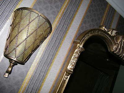
The guest bath has grey trim, wallpaper in black, grey, golds,
granite in mutli black, gold and brown, and a gold metallic ceiling!
And one little window...
I specified tiny loops to be made on my tucked panel so I could slip
them onto holdbacks mounted under the gold ceiling.
I designed this panel from a photo I saw in a magazine.
It was about 1.5 times fuller than the window so it could
drape gently between holdbacks without revealing any window molding.
Once again it is a floor to ceiling treatment.
I designed this panel from a photo I saw in a magazine.
It was about 1.5 times fuller than the window so it could
drape gently between holdbacks without revealing any window molding.
Once again it is a floor to ceiling treatment.
Attaching the gorgeous carved faces of the holdbacks.
This panel is pulled to one side, away from the hopper.
Detail of wallpaper, light fixture and mirror.
Finished view of side-swept panel from medallions.
I've got the mini-cooper loaded and I 'm headed home!
Just another day in the life of a designer helping to bring someones' vision to life.
Photo credit to my son. Thanks Colin!


